colour wheel
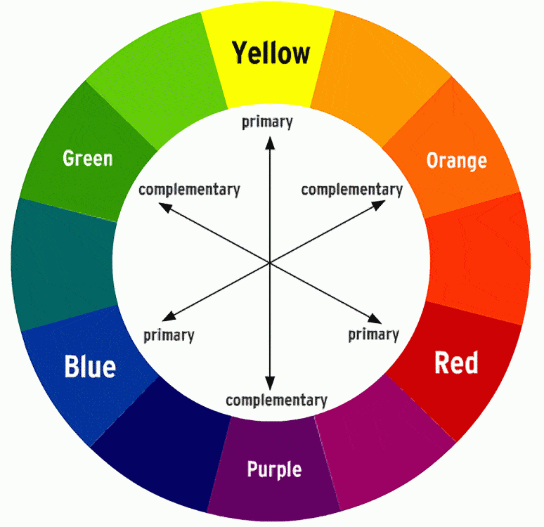
I am fortunate enough to have a basic understanding of the colour wheel already as i have done many creative courses such as art and design that also require this knowledge. when painting any canvas including the face it is imperative to understand which colour complement and contrast against one and other. this is especially important when contouring the face, and doing bright avenge grade style makeup.
as you can see in the above basic chart each primary colour has another complimentary primary colour to match. good example of this is purple and yellow a mixture you may not expect to go well together and it might not feature that frequently in your wardrobe but when blended and used subtly on the face it can create some really aesthetically pleasing looks.
colour theory isn't just used in make-up and art though we see this every day in small things like nature. pansies naturally sprout yellow and purple from the same flower and they are complimented on a daily basis for their beauty.
No comments:
Post a Comment